As October was here, the time had finally arrived. With the crisp and cool autumn air in my lungs, I set foot in a museum which, like much of the rest of New York’s art-loving public,I had eagerly awaited following its four-month, $450-million, and additional-47,000-square-foot makeover. Would New York City’s Museum of Modern Art, a seminal institution for the collection and display of modern art, in its current location since 1939, continue along the lines of its tried and true curatorial direction, adhering to a linear view of the history of Modernism? This history, involving jumps from one predominantly white,male, and European “-ism” to the next has always featured prominently in the museum’s collection.Furthermore, within MoMA’s main exhibition halls, visual art, design, and architecture were always neatly subdivided, all seemingly within different spheres of existence and influence. The resulting hopscotch between temporary exhibitions and discipline-specific shows which filled the permanent collection’s gaps could often cause traffic jams for visitors.
The 2019 MoMA represents a step into the future, one in which we can consider Modernism’s more global and diverse context. It is one where photography, design, and architecture inflect and inform painting and sculpture, and the physical space of the museum allows visitors a more fluid way to enjoy all of the above. Though the main story here is the beginning of the disruption of the institutionalized narrative of Modernism, the seemingly small changes throughout the museum are just as impactful – making this iteration of MoMA more generous to art history and its visitors alike.
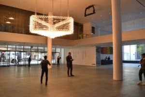
Entering the museum from the 53rd Street entrance, I’m greeted by Philippe Parreno’s commission, an installation of algorithmically controlled marquees hanging in the middle of the new lobby. Providing a cleaner entrance and sequence for visitors, the new entrance hall was a great prelude to what would be a re-imagined collection of some of the world’s greatest modern art. These ground floor galleries are also now free to all visitors, helping showcase the art to a broader audience.
Starting my visit on the fifth floor in the 1880s-1940s galleries, I’m hit with the first significant moment in this re-imagined Modernism: Vincent Van Gogh’s Starry Night (1889) (now in a more subdued, period-appropriate frame) sharing a room with Woman with a Veil (1885) by Medardo Rosso, and the innovative pottery of George Ohr from the American South of the early 20th century. Though these artists may never have met in person or encountered each other’s work, they were all pushing the boundaries of art’s conventions in their own different geographic locations.
In contrast to New York Times architecture critic Michael Kimmelman, who called it “sprawling” and “slightly soulless,” I feel that this fairly static collection of history-changing works has been finally given the room to breathe and be contemplated outside of a structure that has remained functionally unchanged for decades. Some of the works now showcased within the traditional, “greatest hits”sections of the museum include numerous recent acquisitions as well. Part of this change includes museum infrastructure, like the inclusion of dozens of new benches. The few existing before mostly served bored teenagers whiling away the time on their phones, but now will truly allow visitors to have that longer contemplative moment with their favorite works. Other additions include more windows in the galleries, which at times provide a much needed visual break from the sometimes overstimulating curatorial offerings of the museum walls and exhibition spaces. These windows furthermore help maintain the connection between the works and their location within the city.
Moving into the next room, I was delighted to find a gallery dedicated to photography and film from this era, significant due to this media’s often maligned place within the art historical canon. Featuring early videos of New York City’s subway, silver prints from glass negatives of architectural details, and stereoscopic photographs of World War I, this rooms shows artistic depictions of the time period. Much in the same way, other galleries on the fifth floor, such as one devoted to design, seamlessly transition from rooms filled with paintings and sculpture to a completely intact turn-of-the-century German kitchen (itself the earliest work by a female architect (Margarete (Grete) Schütte-Lihotzky) in MoMA’s collection). A room filled with models devoted to an architectural history of the skyscraper, The Vertical City, also did not seem out of place within this dialogue on the development of Modernism.
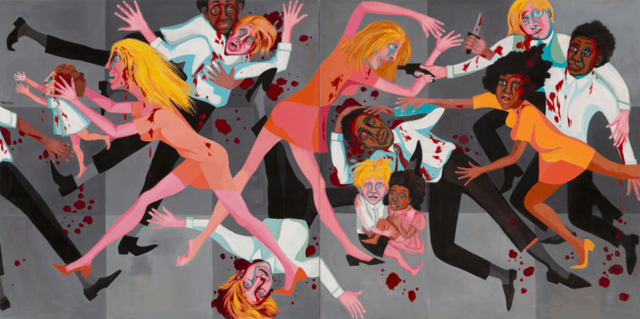
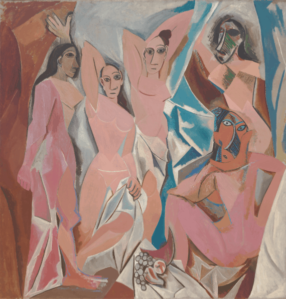
Other rooms present a complete curatorial tour de force, such as Pablo Picasso’s Les Demoiselles d’Avignon (1907) paired with Faith Ringgold’s American People Series #20: Die (1967). The Picasso piece,a seminal example of the artist’s Cubist style and incorporation of European colonial interest in African face masks, and Ringgold’s piece, showing the unrest tied to racial and gender discrimination in America in the 60s and inspired by Picasso’s piece Guernica, engage in a meaningful contextual and visual dialogue. Though these steps in the collection’s curation represent a powerful move away from a prescriptive linear Modernism, the job is only just beginning. However, the museum has vowed to change a third of the entire permanent collection every six months, allowing some of MoMA’s often forgotten treasures and new acquisitions to shine.
 Some spatial curatorial decisions help vary visitors’ engagement with different rooms, such as the Surrealist room, which now has walls painted dark magenta, dim lighting, and interesting physical arrangement of works. An example is Rene Magritte’s False Mirror (1929), hung well above eye level. The work seemingly follows visitors in the room as well as staring down at them across into a neighboring gallery. Other video works are also projected at this height, creating a dynamic contrast with other works in their respective spaces. Another pleasant surprise was a room dedicated to Henri Matisse’s Swimming Pool (1952) from the artist’s Cut-out series. Acting as a tranquil sanctuary from the city, it is a room where visitors can truly find peace within the fourth floor.
Outside of the permanent collection, the museum will of course continue hosting temporary programming, the first iterations of which includes The Shape of Shape (selections from the permanent collection curated by Amy Sillman), a sound/sculpture piece by artist David Tudor, and Betye Saar’s The Legends of Black Girl’s Window, among others.
The approach the museum takes does not feel defensive of its own history. On the contrary, it feels like a more meaningful response and dialogue with those who critically consider the role and responsibility of monolithic cultural institutions in 2019. This does not mean shelving or forgetting the Starry Nights of the collection; rather, we can consider the other artistic developments taking place simultaneous with yesteryear’s canonical greats. With this rehang of its permanent collection, MoMA takes a step forward in both showcasing a greater variety of its vast art holdings and also presenting a more inclusive and diverse view of Modernism. Oh, and did I mention the café now has pretzel croissants.
Author
-

Piotr Pillardy is an arts/music writer for the Red Hook Star-Revue. He received a BA in History of Art and History from Cornell University and lives in Brooklyn
View all posts
Piotr Pillardy is an arts/music writer for the Red Hook Star-Revue. He received a BA in History of Art and History from Cornell University and lives in Brooklyn

