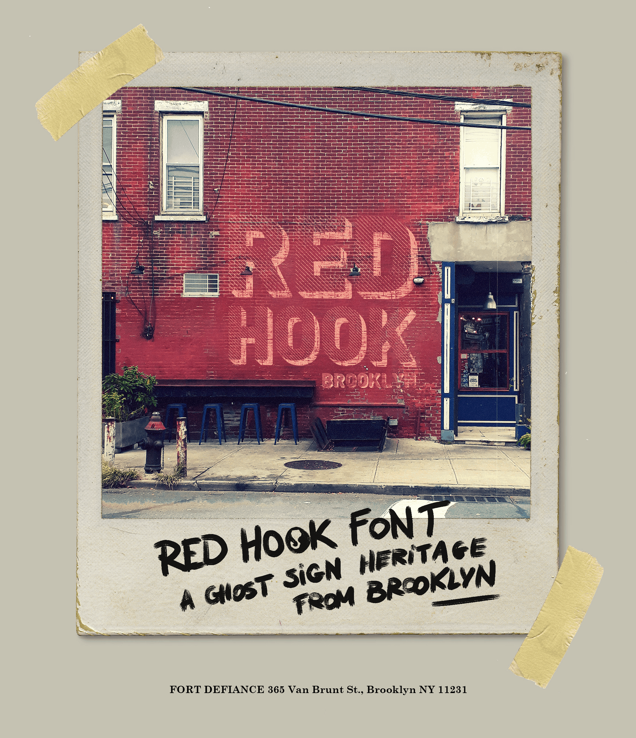
If the spirit of Red Hook – its rugged industrial heritage and small-town warmth – were encapsulated as a typeface, what would it look like? Alexandre Noyer, a French illustrator and graphic designer, has an idea.
Noyer and his girlfriend visited the neighborhood in November. “We were totally charmed by this part of Brooklyn, our walks on the street and discovering the seafront, surrounded by beautiful brick walls, bars, cafes, and docks,” he recalled. It was a pleasure, he said, to “simply drink a beer in a bar, talking with people who live there.”
He also liked the look of some of the signs, old and new, that he spotted in the area – for instance, at 162 Van Dyke Street, whose wall advertises Steve’s Key Lime Pies; on the Red Hook Lobster Pound’s brick facade; and at the Waterfront Barge Museum, whose white letters stand up straight to identify the historic Lehigh Valley Barge #79. “Typography tells a story. It’s the first impression and visual influence before reading the message,” he explained.
After Noyer returned home to Rennes, he created a new font. “For me, it’s what I felt of the identity of Red Hook,” he said. “I tried to imagine the font faded on a massive brick wall or totally colorful on a storefront, as though the typography had always been part of the neighborhood.”
Anyone can download the font – called “Red Hook” – for free at https://www.dafont.com/red-hook.font. Noyer noted that he plans to visit Red Hook again “for sure.”

